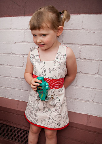
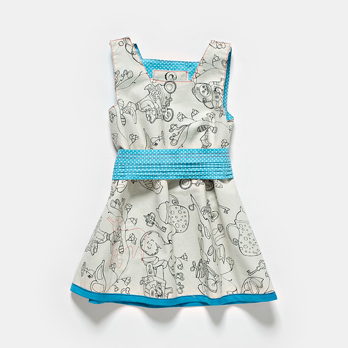
You may imagine, as we are three headstrong women running a business together, we'd encounter frequent butting of heads, however this just isn't the case! We get on extremely well, have heaps of fun and rarely disagree on anything... that is until it comes to the naming of our colour's - geez, what a headache!!
At times we seem almost incapable of agreeing on appropriate names, (though some are much easier than others) and have spent stupidly large amounts of time trying to convince each other that our idea for a name is the better one for this, this and this reason!
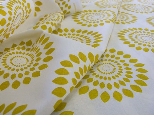
Lara is the romantic one, she likes names that sound pretty but aren't too abstract; Bee is the prudent one, wanting non fussy names that explain the exact colour (the most recent in-house controversy has been over a
greenish yellowy gold kind of colour - which
could end up being named after the plant, "honeysuckle" but the jury is still out); and me the kooky one, I like names that are accurate but descriptive and easy enough to remember!!
So when my dear friend
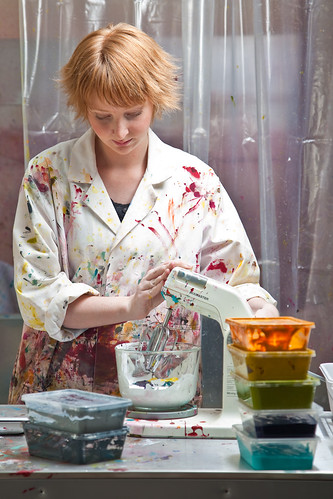
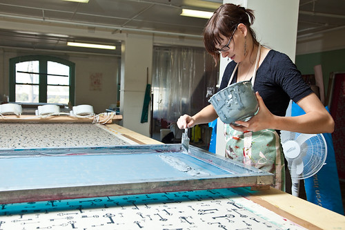
Nathan came up to visit us just before Chrissy, and we of course headed up to the studio to play with some inks! We printed some t-shirts for
funs (and no, we're not going to do this commercially) and he chose to mix a rather beautiful colour, referred to around the studio as Nathan's Blue, and made this:
 Love the print, Nay!
but of course once we decided to print with it, the
unavoidable colour naming 'discussions' ensued...
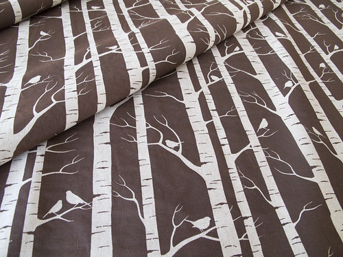
Anyway, so here's a couple of this weeks latest prints - Wrens and
Sumor in
Nathan's Blue /Deep Sea/..? on cotton/linen blend

Will be up in the shop in a week or so!