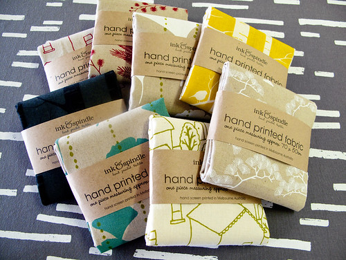
Anyway our old packaging for cut fabric pieces has been bothering me for some time now (bio-degradable cello + header card) so we came up with a much simpler and more natural approach:

I love the way these look now! I can just see these standing up in little rows ordered by colour, like we do our fat quarters. Now off to pester Jem about making us some new market display boxes to put them in!


6 comments:
It looks great! Much better than plastic!
Lovely! Ties in beautifully with the textural feel of the gorgeous fabrics :)
I think the packaging is much better now because it allows customers to touch the fabric. Love it!
Mmmm, looks very tempting!
The packaging looks fabulous! It makes the colors on the fabric pop in contrast. :)
Agreed - lovely, textural and tactile!
Post a Comment