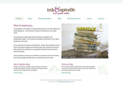
This is how the new design looks, for you feed readers out there:

Simple, clean, friendly & modern (we hope).
I had to force the web designer in me to make a reappearance to get this baby off the ground, so I'm very glad it's done and dusted and looking a lot more like 'us' than the previous design. Yay!


8 comments:
The new site and blog look great. I love the clean look and the font color choices!
Fabulous!!
Congratulations.
All your hard work is looking great.
Yeah looks great. Light and airy. Goodluck.
I think they all look fantastic! Congratulations.
Beautiful prints.
It looks fantastic! Well done :-)
looks wonderful! I did my blog do-over as well, it's a good feeling!
Gorgeous prints and new site. Best of luck to I&S in 2009.
Post a Comment